


Research Visualization: Transforming Complex Science into Clear, Impactful Visuals
- Home
- Academy
- Research Impact
- Research Visualization: Transforming Complex Science into Clear, Impactful Visuals
High-Impact Journals
- Why Research Visualization Matters in Modern Science
- Role of Research Visualization in Academic Publishing
- Types of Research Visualization Used by Researchers
- Research Visualization Across Disciplines
- Best Practices for Effective Research Visualization
- Research Visualization Process: From Manuscript to Visual
- Research Visualization for Digital and Post-Publication Impact
Interesting topics
Research Visualization: Transforming Complex Science into Clear, Impactful Visuals
Research visualization is the practice of transforming complex data and scientific concepts into visual formats (charts, graphs, maps, etc.) to aid in exploration, analysis, and communication, making hidden patterns, trends, and outliers accessible for researchers and wider audiences, bridging the gap between raw data and human understanding. It involves both the science of data analysis and the art of effective design, focusing on clarity, accuracy, and engagement.
It is the strategic usage of visuals in research communication to accurately and clearly represent complex scientific findings, data and concepts. Scientific data visualization enables accurate interpretation of research findings while maintaining methodological integrity. The use of visuals in research communications is more than just charts and figures, but also includes graphical abstracts, visual summaries, infographics, schematic diagrams, and scientific illustrations, allowing readers to understand the basic message of a study quickly .Graphical abstract formats are increasingly used to summarize research data visualization outcomes at a glance.
1. Why Research Visualization Matters in Modern Science
Using research visuals can provide advantages such as:
- Quicker understanding by review and reading audience
- Increased visibility and discoverability of manuscripts
- Enhanced levels of interaction with digital content
- Better ability to communicate among multiple disciplines
Data storytelling helps researchers convey scientific narratives in a way that is accessible to diverse audiences. Studies have shown that articles that are enhanced with visuals receive significantly more
2. Role of Research Visualization in Academic Publishing
Visual analytics allows editors and reviewers to evaluate trends and outcomes more efficiently during assessment, and enhance the research impact. Research visualizations will considerably impact researchers at various stages of their published research product across the publication life cycle:
- Pre-submission: Help clarify hypothesis and study design
- Peer review: Support peer reviewers in assessing methodology and outcomes
- Post-publication: Enhance the dissemination of knowledge and impact
Increasingly high-quality journals are now encouraging or requiring graphical abstracts and visual summaries to increase public access to the results of a study [4,5].
3. Types of Research Visualization Used by Researchers
In scholarly communication, research visualization takes on several distinct formats, specifically created for specific reasons. The table below illustrates some of the more popular forms of research visualizations.
Visualization Type | Purpose |
Summarize the entire study | |
Explain workflows or results | |
Scientific Diagrams | Show mechanisms or models |
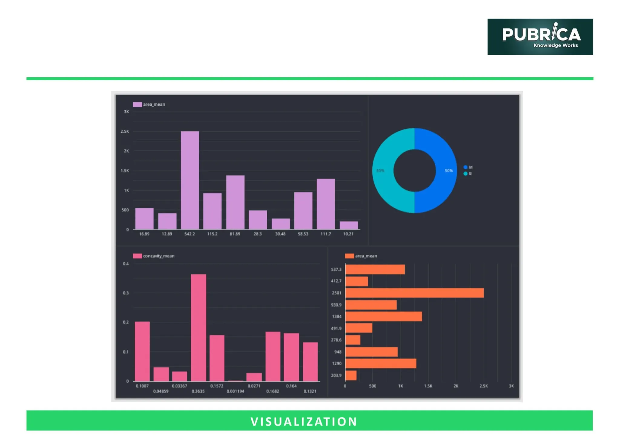
Data Visualizations | Present quantitative results |
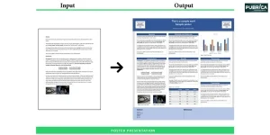
Promote research digitally |
Charts and graphs for research remain foundational tools for presenting quantitative results clearly. Complex data visualization techniques are often required when dealing with multidimensional or large-scale datasets.
4. Research Visualization Across Disciplines
Visualizing data is applicable across many fields:
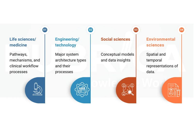
Cross-disciplinary flexibility increases collaboration and understanding between disciplines.[6] Scientific visualization tools enable researchers to adapt visual methods across disciplinary boundaries. Interactive data visualization supports cross-disciplinary exploration by allowing users to engage dynamically with research findings.
5. Best Practices for Effective Research Visualization
To ensure accuracy and clarity, effective research visualization follows these principles:
- Prioritize clarity over decorative complexity
- Use consistent colour schemes and visual hierarchies
- Align visuals with journal guidelines
- Ensure scientific accuracy through expert validation
Data visualization techniques should be selected based on the research question and target audience. Poorly designed visuals can mislead or confuse readers, reducing impact. [7]
6. Research Visualization Process: From Manuscript to Visual
To develop effective research visuals, a methodical and incremental process has been identified that merges visual communication best practices with scientific accuracy. The key stages involved in this workflow are summarized below
Stage | Key Activities |
Content Analysis | Identify key messages and data |
Visual Storyboarding | Structure information flow |
Design & Illustration | Create accurate visuals |
Review & Compliance | Check journal specifications |
Final Delivery | Publish-ready formats |
Professional data visualization services often follow standardized workflows to ensure quality and compliance. Data visualization software is commonly used at multiple stages of this workflow to improve efficiency.
7. Research Visualization for Digital and Post-Publication Impact
Visual research outputs have been shown to enhance altimetric by providing additional means for the wider dissemination of visual content including:
- Conference presentations
- Journal Websites
- Social media platforms
- Institutional Repositories
AI data visualization tools are increasingly applied to optimize visual content for digital dissemination. The creation of visual abstracts appears to further improve their extent of reach beyond traditional academic audiences [8,9]
Connect with us to explore how we can support you in maintaining academic integrity and enhancing the visibility of your research across the world!
Conclusion
Research visualizations are no longer optional; they are now powerful tools of communication. They help researchers to understand and communicate their research and contribute to faster, more effective peer review. By presenting complex scientific information in clear visual formats, including figures and a graphical abstract, researchers can more effectively convey their findings to other scientists as well as to broader audiences such as journalists and policymakers who may not be familiar with the technical aspects of their research.
Let Pubrica help you communicate complex science effectively through professionally designed research visualizations and graphical abstracts. [Get Expert Publishing Support] or [Schedule a free Consultation].
References
- The visual display of quantitative information [book reviews]. (1988). IEEE Power Engineering Review, 8(2), 20–20. https://doi.org/10.1109/mper
- Bik, H. M., & Goldstein, M. C. (2013). An introduction to social media for scientists. PLoS Biology, 11(4), e1001535. https://doi.org/10.1371/journal.pbio
- Graphical abstract. (n.d.). Www.elsevier.com. Retrieved January 21, 2026, from https://www.elsevier.com
- Stricker, K. (2023, May 26). What is a graphical abstract and why do I need one for my paper?Springer Nature Research Solutions. https://solutions.springernature.com
- Cairo, A. (2016). The Truthful Art: Data, Charts, and Maps for Communication. New Riders. https://ptgmedia.pearsoncmg.com/images
- Rodríguez Estrada, F. C., & Davis, L. S. (2015). Improving visual communication of science through the incorporation of graphic design theories and practices into science communication. Science Communication, 37(1), 140–148. https://doi.org/10.1177/10755470
- Ibrahim, A. M., Lillemoe, K. D., Klingensmith, M. E., & Dimick, J. B. (2017). Visual Abstracts to Disseminate Research on Social Media: A Prospective, Case-control Crossover Study. Annals of surgery, 266(6), e46–e48. https://doi.org/10.1097/SLA.000
- Fitzgerald, R. T., & Radmanesh, A. (2015). Social media and research visibility. American journal of neuroradiology, 36(4), 637. https://doi.org/10.3174/ajnr.A4054