Pubrica

Interpretation, Reporting and Visualisation

Pubrica excels in Interpretation, Reporting, and Visualisation, offering concise analysis presented through clear and impactful visuals, empowering informed decision-making in research and business endeavours.

Turn your complex research data into clear, compelling, and publication-ready insights with Pubrica’s expert Interpretation, Reporting, and Visualisation services.

At Pubrica, we help researchers, clinicians, and businesses bridge the gap between data generation and knowledge dissemination. Our scientific data interpretation, reporting, and visualisation services ensure that your research findings are not just statistically sound but also effectively communicated, compliant with global standards, and impactful for your target audience.

Whether you are preparing a clinical trial report, academic manuscript, regulatory submission, or business intelligence dashboard, we transform raw data into clear narratives, structured reports, and intuitive visualisations that drive decision-making.

poster presentation

What We Do

Our service bridges the gap between raw data and meaningful knowledge by offering:

Data Interpretation

We provide precise statistical and contextual interpretation of your data, highlighting key findings, patterns, and relationships. Our experts ensure clarity by translating numbers into narratives that support decision-making. With our research data interpretation expertise, we ensure that insights are accurate, meaningful, and actionable.

Comprehensive Reporting

From detailed research reports to concise executive summaries, we prepare structured documents tailored to your audience. We follow international guidelines such as CONSORT, PRISMA, and STROBE to ensure compliance, transparency, and reproducibility. Our data reporting and visualization services make your results publication-ready and impactful.

Data Visualisation

Using advanced tools and techniques, we create intuitive visualizations, graphs, dashboards, infographics, and interactive charts that simplify complex datasets. Our medical data visualization services and scientific visualization services help you engage stakeholders, reviewers, and policymakers with clarity and impact.

Why Interpretation, Reporting, and Visualisation Matter

  • Clarity in Communication: Helps simplify complex findings for diverse audiences.
  • Enhanced Publication Success: Professionally interpreted and reported results improve acceptance in high-impact journals.
  • Informed Decision-Making: Clear visualizations support strategic decisions in research, healthcare, and business.
  • Credibility & Compliance: Standardised reporting ensures ethical integrity and regulatory approval.

Types of Interpretation, Reporting, and Visualisation We Offer

Interpretation involves methods like quantitative and qualitative analysis, while reporting presents these insights in a structured narrative using formats like dashboards and presentations. Visualization is the process of converting data into visual formats such as bar charts, pie charts, line graphs, and heat maps to reveal patterns, trends, and outliers, making complex information accessible for understanding and decision-making. 

Types of Interpretation
  • Quantitative Interpretation: Analyses numerical data using statistical methods to find patterns and insights.
  • Qualitative Interpretation: Analyses non-numerical data, such as text, to understand themes and contexts.
Types of Reporting
  • Dashboards: Provide a high-level view of key performance indicators (KPIs) and data trends in a structured format. 
  • Presentations: Structured formats, often including visualizations, to communicate findings to stakeholders or decision-makers. 
  • Detailed Narrative Reports: Comprehensive reports that provide context, explanation, and detailed findings are often used to share in-depth information. 
Types of Visualization
  • Bar Charts: Use horizontal or vertical bars to compare data across different categories, where the length of the bar represents the value. 
  • Pie Charts: Show the proportion of a whole by dividing a circle into slices, useful for displaying percentages. 
  • Line Graphs: Connect data points with lines, ideal for showing trends and patterns in continuous data over time. 
  • Histograms: Similar to bar charts, but used to show the distribution of numerical data by grouping it into bins. 
  • Scatter Plots: Display individual data points to show the relationship or correlation between two variables. 
  • Tables: Present data in rows and columns, useful for organizing and displaying large amounts of detailed statistical information. 
  • Heat Maps: Use variations in colour on a grid to represent the magnitude or intensity of individual values within a dataset. 
  • Gantt Charts: Used for project management, showing tasks and their durations over a timeline. 

Who We Serve

At Pubrica, we support a wide spectrum of stakeholders who rely on accurate data analysis and interpretation, clear reporting, and insightful visualisation to make informed decisions, advance research, and communicate findings effectively. Our services are designed to bridge the gap between raw data and meaningful insights for decision-making, tailored to meet the needs of:

Animated Card Hover Effect Html & CSS

Academic Researchers & Scholars

We help researchers in universities and institutes transform complex datasets into comprehensible results through data visualization with infographics and structured formats that align with journal publication standards. Our expert team ensures clarity, reproducibility, and precision in reporting.

Animated Card Hover Effect Html & CSS

Clinical Researchers & Healthcare Professionals

From clinical trials to patient outcome studies, we provide graphical presentations of research data that meet regulatory standards, enhancing transparency, compliance, and evidence-based decision-making.

Animated Card Hover Effect Html & CSS

Pharmaceutical & Biotech Companies

We support R&D teams by presenting research outcomes and trial data in clear, structured formats for internal reviews, regulatory submissions, and scientific communications.

Animated Card Hover Effect Html & CSS

Corporations & Business Analysts

Businesses use our reporting and data visualisation services to derive actionable insights from analytics, streamline operations, and communicate trends effectively to stakeholders.

Animated Card Hover Effect Html & CSS

Government & Non-Governmental

Organisations (NGOs) For policy-making, program evaluation, and funding assessments, we provide data interpretation and reporting that aid in evidence-driven strategies and measurable impact.

Animated Card Hover Effect Html & CSS

Publishers & Scientific Communication

Professionals We collaborate with publishers to prepare publication-ready figures, data tabulation and summarization, and reports that adhere to international standards and enhance the readability and impact of scientific manuscripts.

Interpretation, Reporting and Visualisation

Pubrica provides comprehensive interpretation, reporting, and visualization services, transforming data into actionable insights through clear analysis and visually engaging presentations for informed decision-making.

How Our Interpretation, Reporting, and Visualisation Service Works

Our Step-by-Step Process

1
Services

Consultation & Requirement Gathering

We begin by understanding your research goals, study design, and data sources.

Services

Data Analysis & Interpretation

Our subject matter experts and statisticians work together to derive meaningful insights from your raw datasets.

2
3
Services

Drafting the Report

We create structured reports that include methodology, findings, discussions, and conclusions in compliance with journal or regulatory guidelines.

Services

Designing Visual Outputs

We create customised visual graphs, dashboards, tables, and infographics tailored for your target audience.

4
5
Services

Review & Finalisation

A thorough peer review ensures accuracy, readability, and alignment with your objectives before delivery.

Our Comprehensive Interpretation, Reporting, and Visualisation

Pubrica’s professional interpretation, reporting, and visualization services to enhance your insights. With our expert guidance, your data presentation is poised to maximize clarity and drive impactful outcomes.

  • Storyboard creation, plus designing new, customized templates and graphs.
  • Posting/tabulating charts, modifying existing data visualisations, and producing reports/presentations in PPT, Word, or PDF formats.
  • Automated, macro-driven charting and reporting to streamline repetitive work.
  • Expert team: data scientists and researchers who interpret data meaningfully to align with your domain (medical, clinical research, etc.).
  • Strong guarantees: timely delivery (sometimes in as fast as 8 hours), security via strict NDAs, and quality assurance.

Our Compliance and Guideline Standards

At Pubrica, we maintain the highest standards of compliance and ethical practice in delivering interpretation, reporting, and visualisation services. Our processes are guided by international best practices, regulatory frameworks, and discipline-specific standards to ensure that every output is accurate, transparent, and tailored to client needs.

Ethical and Regulatory Compliance
  • Adherence to ICMJE, EQUATOR, CONSORT, PRISMA, STROBE, and COPE guidelines.
  • Compliance with Good Clinical Practice (GCP) and Good Publication Practice (GPP-2022).
  • Protection of intellectual property, confidentiality, and data integrity.
Visualisation Best Practices
  • Data visualisations designed for clarity, accuracy, and impact.
  • Use of standardised graphical representation methods (CONSORT diagrams, Kaplan–Meier curves, forest plots, heatmaps, dashboards, etc.).
  • Compliance with journal and regulatory submission standards for graphical abstracts and infographics.
Transparent Reporting Standards
  • Structured presentation aligned with journal, regulatory, and funding body requirements.
  • Use of standardized frameworks such as ICD, MeSH, and WHO classifications where applicable
  • Ensuring traceability of data sources for verification and reproducibility.
_Interpretation, Reporting and Visualisation Sample Work

Interpretation, Reporting and Visualisation Sample Work

Download the full Report Now

Explore our interpretation, reporting, and visualisation sample work, meticulously crafted to adhere to journal-specific formatting guidelines, robust methodological standards (e.g., PRISMA, CONSORT, STROBE), and project timelines, ensuring accurate, publication-ready, and visually compelling insights for research, clinical, or business applications.

Interpretation, Reporting, and Visualisation – Our Packages

At Pubrica, we offer tailored packages designed to meet the diverse needs of researchers, clinicians, and businesses. Our flexible service models ensure that you receive the right level of support, whether you need end-to-end assistance or targeted expertise.

basic pacakge

Basic

Data interpretation with essential statistical analysis

Concise reporting (2–3 pages)

Basic charts, graphs, and tables

Standard

Standard

In-depth interpretation with methodological explanation

Comprehensive reporting (structured per journal/industry standards)

Advanced visualisations (heat maps, trend analysis, comparative charts)

References to relevant guidelines and literature support

pro.webp

Premium

End-to-end data interpretation with advanced statistical modelling

Detailed, guideline-compliant reporting (CONSORT, STROBE, PRISMA, TRIPOD, etc.)

High-quality custom visualisations (interactive dashboards, infographics, predictive modelling visuals)

Executive summary for decision-making

Multiple rounds of review and refinement

Testimonials

Discover how Pubrica’s interpretation, reporting, and visualisation service has empowered researchers and businesses to transform complex data into clear, guideline-compliant reports and intuitive visualisations that strengthen evidence-based decisions, accelerate regulatory approvals, and elevate publication impact. Here is what our clients say:

Testimonial Slider

Frequently Asked Questions – Interpretation, Reporting, and Visualisation

Our services are ideal for:

  • Researchers preparing manuscripts for journals
  • Clinicians and trial sponsors compiling regulatory submissions
  • Academic institutions and students presenting thesis/dissertations
  • Businesses seeking actionable insights from data

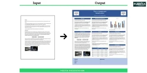
We create journal-ready manuscripts, clinical study reports, white papers, regulatory documents, business reports, and academic submissions, all tailored to the specific guidelines and standards required.

Yes. We adhere to widely accepted guidelines, including CONSORT, PRISMA, STROBE, TRIPOD, ICH, GCP, and journal-specific requirements, ensuring accuracy, compliance, and credibility.

We offer a range of visual outputs, including:

  • Basic graphs and tables
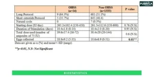
  • Comparative charts and trend analysis
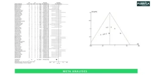
  • Heat maps and forest plots
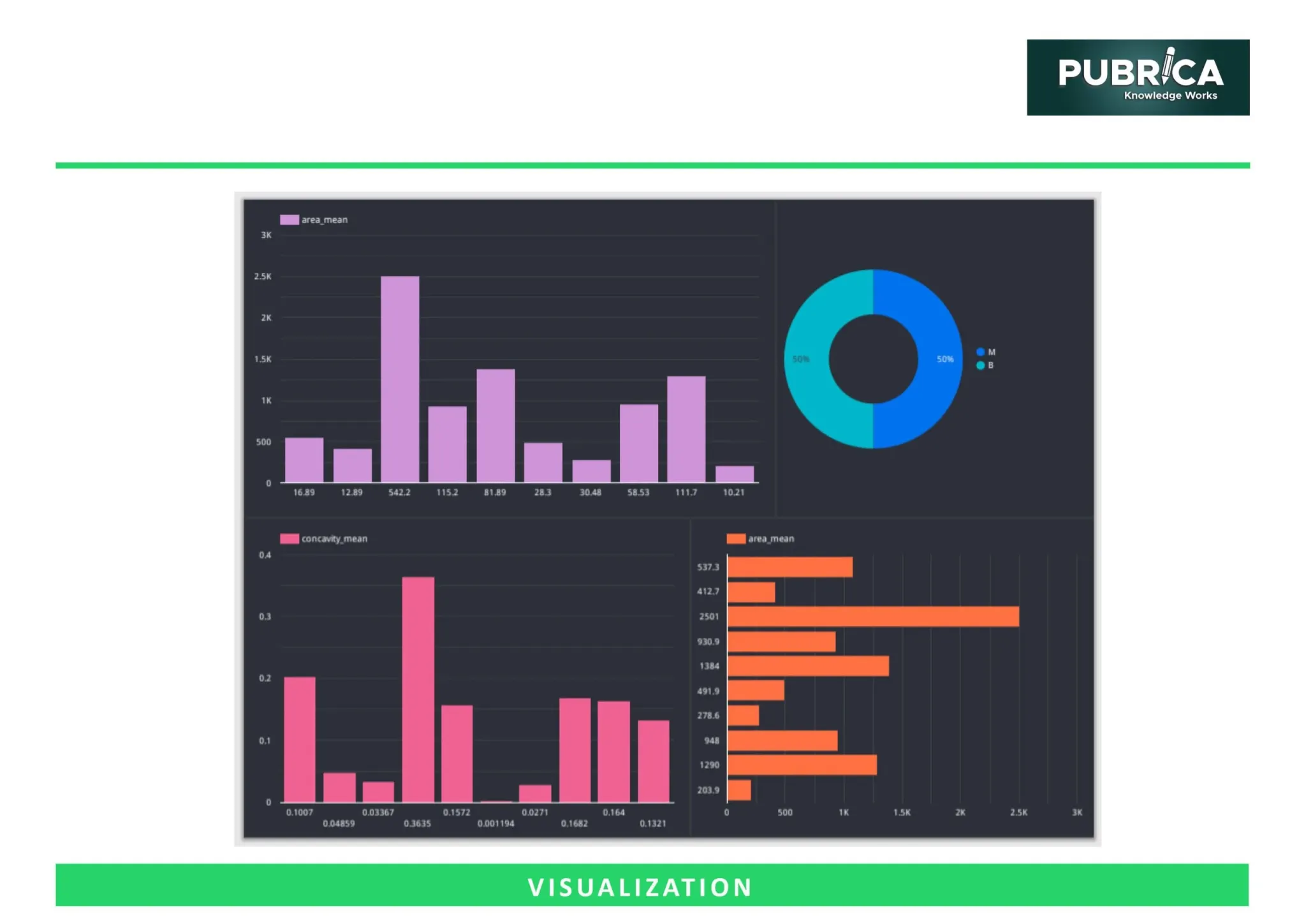
  • Infographics and dashboards
  • Interactive data visualisations for digital use

Our team uses validated statistical tools, double-checks results through peer review, and ensures that every conclusion is backed by evidence and aligned with the study objectives.

Simply share your project details, dataset, and reporting requirements. Our team will assess your needs and recommend the most suitable package.

Insights

Organize journal matching by different decision-making filters:

How to Structure Case Reports and Review Articles for Medical Journals

Medical journals expect a structure for case reports and review articles, with clear objectives....

Article

How Should Physicians Choose the Right Journal for Submitting a Case...

Publishing a case report involves more than clinical knowledge; it also demands strategic journal ....

Article

How Physicians Can Write Clear and Impactful Patient Education Materials

Effective patient education materials (PEMs) are crucial for promoting health literacy, enhancing....