
- Services
- Discovery & Intelligence Services
- Publication Support Services
- Sample Work
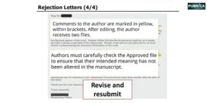
Publication Support Service
- Editing & Translation
-
Editing and Translation Services
- Sample Work

Editing and Translation Service
-
- Research Services
- Sample Work
Research Services
- Physician Writing
- Sample Work

Physician Writing Service
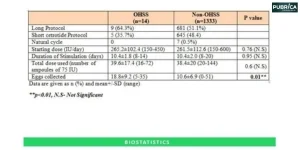
- Statistical Analyses
- Sample Work
Statistical Analyses
- Data Collection
- AI and ML Services
- Sample Work
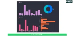
AI and ML Services
- Medical Writing
- Sample Work
Medical Writing
- Research Impact
- Sample Work
Research Impact
- Medical & Scientific Communication
- Sample Work

Medical & Scientific Communication
- Medico Legal Services
- Educational Content
- Academic Editorial Services
- Sample Work
Academic Editorial Services
- Educational Editorial Service
-
Education Editorial Services
- Sample Work
Education Editorial Services
-
- Industries
- Subjects
- About Us
- Academy
- Insights
- Contact Us
Enhancing Forest Plots for Effective Meta-Analysis Visualisation
High-Impact Journals
- What is a Forest Plot?
- Why Forest Plots are Important in Meta-Analysis
- Key Components of a Forest Plot
- Common Challenges in Forest Plot Interpretation
- Strategies to Enhance Forest Plot Visualisation
- Modern Tools for Creating Advanced Forest Plots
- Best Practices for Publication-Ready Forest Plots
- Conclusion
Interesting topics
Enhancing Forest Plots for Effective Meta-Analysis Visualisation
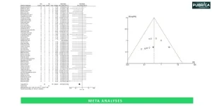
In many research domains, including healthcare, social science, and psychology; meta-analysis forest plot is commonly used to aggregate results from several studies into one concise conclusion. Each study has its own result, and all studies should have an overall pooled estimate. This personal individual study result, and its corresponding pooled estimate, is known as the forest plot in meta-analysis.
Although the forest plot visualization itself can be a very informative representation of the data being reported, some of the traditional forest plot designs often lack clarity, mostly due to readers without a statistical background interpreting the data. Enhancing the forest plot through better design, clear labelling, colour combinations and using more modern visualisation techniques can greatly increase the quality of communication regarding the reporting of meta-analysis results interpretation. [1]
Overview of Forest Plot Visualisation
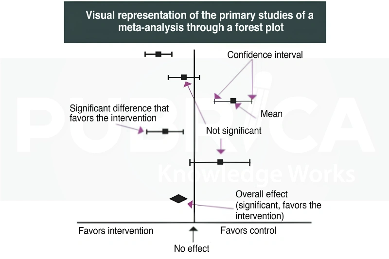
1. What is a Forest Plot?
Forest plots graphically display outcomes from several individual research papers in relation to one another to provide an estimate of the impact of a certain intervention on the outcome of interest in multiple studies. [2]
Researchers can evaluate some common metrics on the forest plot examples in systematic reviews, such as;
- Comparing results between studies
- determining if the results are consistent among the studies
- visualising confidence intervals
- determining if there is an overall effect of the treatment on the outcome of interest
- assessing the heterogeneity among studies
For example, if evaluating the effect of a new drug, the effect of treatment from individual studies is shown as a square and horizontally across the square is a line showing the confidence interval. The overall effect is shown by a diamond.
2. Why Forest Plots are Important in Meta-Analysis
Meta-analysis methods rely heavily on forest plot visualisation since they show results from multiple studies in one place. They give you the effect sizes for each study along with their confidence intervals and a grand summary effect size based on everything together. Plus, they make it easy to spot trends and see how alike or different all the studies are immediately. [3]
Applications
Research Area | Example Application |
Healthcare | Drug efficacy studies |
Psychology | Behavioral intervention analysis |
Education | Learning outcome comparisons |
Public Health | Disease prevention programs |
Social Sciences | Policy effectiveness evaluation |
3. Key Components of a Forest Plot
Understanding each element of a forest plot is essential for accurate interpretation.
Component | Function |
Study Identifier | Lists included studies |
Effect Size | Shows treatment effect or association |
Confidence Interval | Indicates precision of estimate |
Weight (%) | Contribution of each study |
Null Line | Represents no effect |
Diamond | Overall pooled effect |
Heterogeneity Statistics | Measures variability among studies |
4. Common Challenges in Forest Plot Interpretation
Forest plots in meta-analysis are very helpful but can have a variety of challenges for use. [4]
4.1. Visual Overcrowding
Large meta-analyses may contain many studies, which makes the plot difficult to read.
4.2. Complex Statistical Information
Statistical measures can present complications to non-statistical audiences. Examples of the statistical measures that can confuse are:
- Odds Ratios (OR)
- Risk Ratios (RR)
- Confidence Intervals (CI)
- Heterogeneity Statistics (I²)
4.3. Poor Formatting
Some examples of problems with formatting forest plots include:
- font size that is too small
- incompletely scaled
- overlapping confidence intervals
- minimal visual differences between studies
5. Strategies to Enhance Forest Plot Visualisation
Creating effective forest plots for research can be improved by enhancing readability, visual clarity, and statistical interpretation.
| Enhancement Area | Recommendations / Features | Benefits |
| Improve Labelling and Readability | Include author names and publication years (e.g., Smith et al., 2024), use descriptive subgroup titles, clearly label effect measures, and increase font size for publication. | Faster understanding and improved readability. |
| Optimise Confidence Interval Display | Use consistent line thickness, prevent overlap where possible, and visually differentiate significant and non-significant findings. | Better interpretation, improved visual balance, and increased statistical transparency. |
| Use Proportional Study Weights | Represent study weights through square size: Large Square = High Weight, Medium Square = Moderate Weight, Small Square = Low Weight. | Helps readers quickly identify influential studies. |
| Incorporate Strategic Colour Coding | Use colours such as Green = Favour Treatment, Red = Favour Control, Blue = Neutral Effect, and Grey = Non-significant Findings. | Faster interpretation, better visual appeal, and clearer communication of results. |
| Highlight Subgroup Analyses | Display subgroups such as Male vs Female, Adults vs Children, High Dose vs Low Dose, and Geographic Regions. | Reveals hidden trends, supports personalized interventions, and improves clinical relevance. |
| Present Heterogeneity Clearly | Prominently display heterogeneity statistics (I² values) and their interpretation. | Enables readers to assess consistency and variability among studies. |
6. Modern Tools for Creating Advanced Forest Plots
Several software tools support high-quality forest plot visualisation. [5]
Software | Main Advantage |
RevMan | Standard systematic review software |
R (metafor package) | Highly customizable graphics |
Stata | Advanced statistical visualization |
Comprehensive Meta-Analysis (CMA) | User-friendly interface |
JASP | Free and open-source option |
Features Available
- Custom colour schemes
- Interactive plots
- Subgroup analysis visualization
- Publication-ready export formats
7. Best Practices for Publication-Ready Forest Plots
- Maintain consistent formatting: Use uniform fonts, symbols, colours, and spacing throughout the plot for a professional appearance.
- Use high-resolution images: Ensure figures remain clear and readable in both digital and print publications.
- Clearly label statistical measures: Include effect sizes, confidence intervals, and study weights to aid interpretation.
- Include subgroup analyses where relevant: Present subgroup results to highlight differences between study populations or interventions.
- Display heterogeneity statistics: Report measures such as I² to help readers assess variability among studies.
- Follow journal-specific guidelines: Adhere to the target journal’s requirements for figure format, style, and reporting standards.
Connect with us to explore how we can support you in maintaining academic integrity and enhancing the visibility of your research across the world!
Conclusion
Meta-analysis forest plot visualisation has traditionally been aided by forest plots in meta-analysis, which summarise all the results from multiple studies in one figure; however, their visual effectiveness relies on the way they are displayed. Specifically, improved display of readability, clearly displaying confidence intervals, displaying different colours for each study or type of study, highlighting the results of a subgroup analysis and displaying the level of heterogeneity in results will help researchers in creating effective forest plots for research and improve meta-analysis results interpretation.
As systematic reviews and meta-analyses continue to influence and guide scientific and clinical decision-making, the role of a good forest plot will increasingly facilitate the translation of complex statistical findings into practical actions.
Enhancing Forest Plots for Effective Meta-Analysis Visualisation. Our Pubrica consultants are here to guide you. [Get Expert Publishing Support] or [Schedule a Free Consultation]
References
- Sarkar, S., & Baidya, D. K. (2025). Meta-analysis – interpretation of forest plots: A wood for the trees. Indian journal of anaesthesia, 69(1), 147–152. https://doi.org/10.4103/ija.ija_1155_24
- Dettori, J. R., Norvell, D. C., & Chapman, J. R. (2021). Seeing the Forest by Looking at the Trees: How to Interpret a Meta-Analysis Forest Plot. Global spine journal, 11(4), 614–616. https://doi.org/10.1177/21925682211003889
- Chang, Y., Phillips, M. R., Guymer, R. H., Thabane, L., Bhandari, M., Chaudhary, V., & R.E.T.I.N.A. study group (2022). The 5 min meta-analysis: understanding how to read and interpret a forest plot. Eye (London, England), 36(4), 673–675. https://doi.org/10.1038/s41433-021-01867-6
- Ioannidis, J. P., Patsopoulos, N. A., & Rothstein, H. R. (2008). Reasons or excuses for avoiding meta-analysis in forest plots. BMJ (Clinical research ed.), 336(7658), 1413–1415. https://doi.org/10.1136/bmj.a117
- Kolaski, K., Logan, L. R., & Ioannidis, J. P. A. (2023). Guidance to best tools and practices for systematic reviews. Systematic reviews, 12(1), 96. https://doi.org/10.1186/s13643-023-02255-9