

Make an Impact with your Scientific Illustrations
November 2, 2018
Presentation Matters; Effective Table Formatting Tips
November 2, 2018Data Visualization Made Easy
The domain of data visualization presents several tools that facilitates data visualization. The potential of these tools needs to be harnessed to detect patterns and trends within the data that is normally not possible to identify with plain numbers within a table. Would you be pleased to open a spreadsheet and be bombarded with sheets and sheets of columns that hardly offer any valuable insight into the data?
In the present day where data has assumed much significance, PhD research scholars, students and corporates are keen to develop data sheets that are effective and informative. However, data visualization is something that is rarely taught in schools or covered during corporate trainings. Most researchers, students who have to handle data, learn to effectively present it through trial and error. As a result, there are bound to be mistakes and they often make choices that have the propensity to disorient or confuse their audience.
Data visualization can be a critical tool that will help researchers and students to present and convey the findings of their research. However, in order to realize their true potential, it is imperative for researchers to follow these tips that will enable their readers to decode their visualizations.
Tip #1 – Simplify
The golden rule that you need to follow in data visualization is to simplify the information that you present with your charts. It is necessary that you select the simplest manner to project your information.
Tip #2 – Convey a Specific Message
Since researchers are eager to convey the results of their research, they have a specific objective. Therefore, it would help if you identify the association and patterns of your data and only highlight the data that you want to project.
Tip #3 – Choose the Right Form of Chart
Choose a chart that suits your objectives. It would also help if you are aware of the merits and demerits of the chart you choose. Some commonly used charts for data visualization are depicted below:-
- Bar Charts
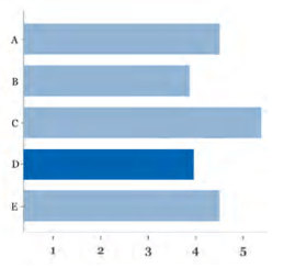
Bar charts are best for depicting when the data is nominal. It is also frequently utilized to project comparisons. Make sure that the value axis always begins with a zero and a consistent scale is used.
- Pie Charts
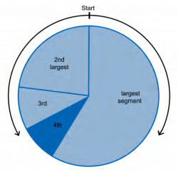
With pie charts, you need to project slices within a whole. However, ensure that the number of slices are not more than five and the consolidated value should total 100%. The slice with the largest number should begin at the top and should appear clock-wise.
- Scatter Plots
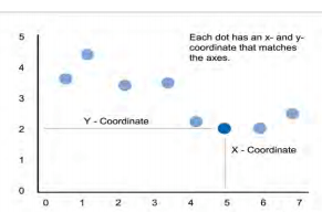
Scatter plots can be effective in projecting associations between two variables. They are particularly useful when you are handling large sets of data and lay emphasis on correlations or patterns. The inherent drawback of a scatter plot is that there is a possibility that your audience might assume a cause-and-effect association between the two axes (X & Y), even though there is no apparent association.
- Node Link Diagrams
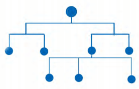
Node link diagrams can be useful when you must present the structure of the data or its hierarchical ordering. The impact of this diagram is felt most when you place the parent node at the top while the other nodes are placed below.
There are more ways through that will help you in data visualization and many more tips that will enable you to master effective data visualization techniques. Keep coming back for more tips in our next article.